The Psychology of Pre-Roll Packaging: Why Customers Buy Before They Ever Light Up
Packaging does a lot more than just holding a product when it comes to cannabis retail. First impressions are shaped, expectations are set, and the influence of whether or not someone picks your product over the other ten boxes is real.
And with pre-rolls specifically, those decisions happen fast.
The majority of customers aren’t standing around analyzing each option they see like they do when they’re shopping for a car. The typical person is scanning shelves, looking online, or asking budtenders for a quick rec, all while trying to narrow their decision down in a matter of seconds. That means your packaging plays a huge role in that first impression before the product is even opened.
That is what makes pre-roll packaging psychology so important.
The most successful brands understand that consumers aren’t just reacting to strain names or THC levels, but they’re looking at the identity, trust, convenience, and overall vibe that the product gives off. Packaging becomes part of the experience long before the joint gets lit.
Customers Decide Faster Than You Think
People like to think that they’re making purchasing decisions logically, but the majority of those purchases are made emotionally first. Your brain makes a snap judgement, and then looks for information to back everything up afterward.
Cannabis is no different.
The second someone sees packaging on the shelf, their brain is already asking questions:
- Does this feel premium?
- Does this look fresh?
- Is this going to be a harsh or smooth burn?
- Does this brand feel modern or outdated?
- Would I actually want to pull this out around my friends?
Most people are not consciously thinking through every one of those questions, but they are absolutely reacting to them.

All of that matters because dispensaries can feel overwhelming, especially to newer consumers. There are hundreds of products with similar names, overlapping effects, and tons of brands all competing for the same thing: the buyer’s choice. Customers naturally look for shortcuts to help make a quicker decision making process, and packaging has become one of those shortcuts.
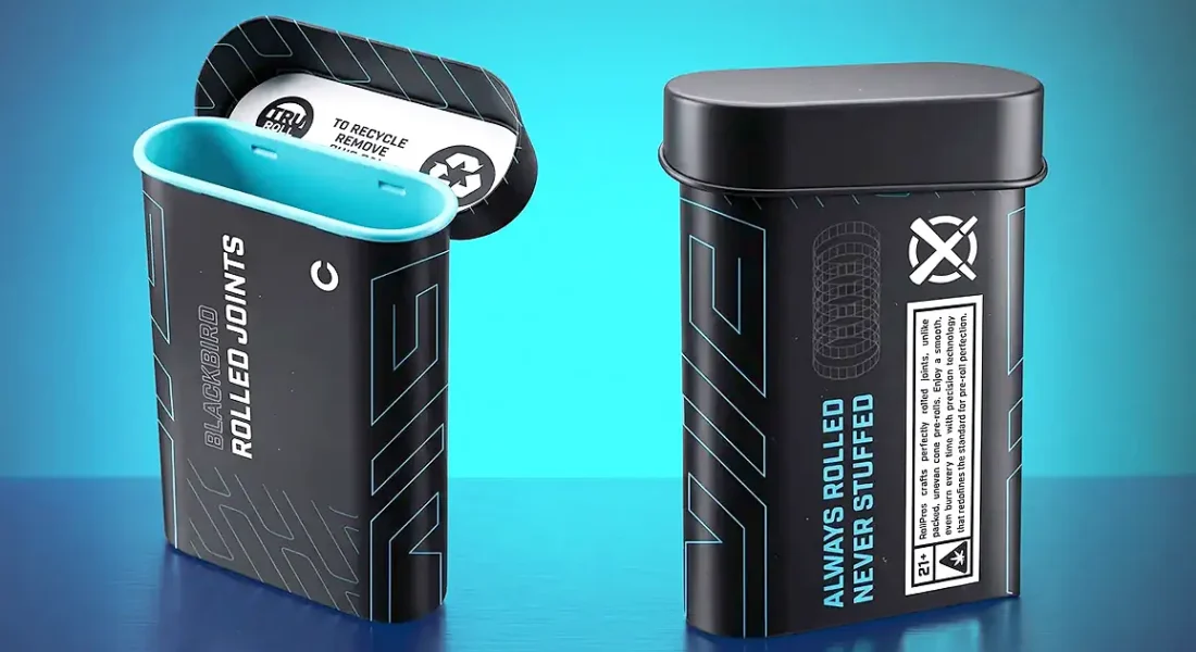
A simple matte tube with clean typography creates an entirely different feeling than a bright or loud package covered in metallic graphics and multiple fonts. One may feel more elevated and intentional while the other may feel energetic and chaotic. While neither approach is wrong, they definitely attract different customers and create entirely different expectations before the product is ever used.
The key here is making sure the packaging actually matches the experience inside. When the branding and the product feel aligned, customers trust it more.
Pre-Rolls Are More Emotional Than People Realize
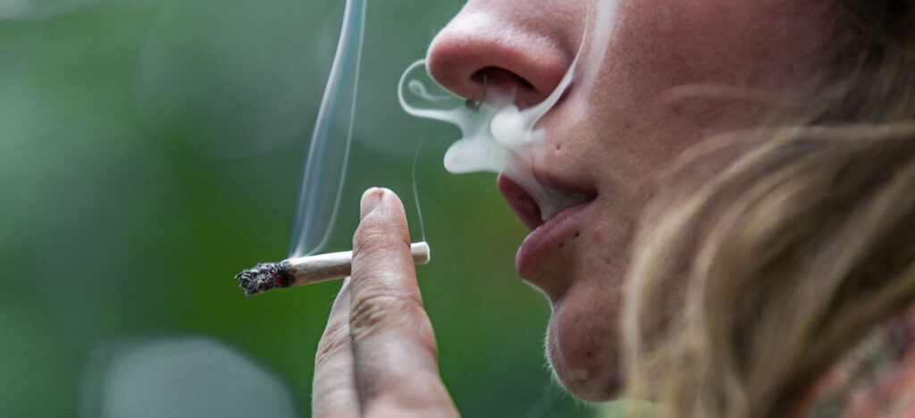
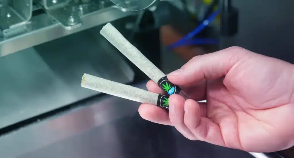
Pre-rolls live in a bit of a limbo space because they can be both practical and emotional purchases for consumers. People buy them for the convenience factor. No grinder, no rolling, no setup. Easy. But they also buy them for moments.
Pre-rolls are tied to concerts, hikes, beach days, camping trips, vacations, parties, and random late nights with friends. They are social products. They are spontaneous products. A lot of the time, they are bought because someone wants an experience, not just because they want cannabis.
That changes how packaging works. It means the packaging is doing a lot more than just protecting the product. It becomes a part of the lifestyle surrounding it. It’s something consumers carry with them, leave outside on tables, toss into bags, and even post on social media. Whether or not brands recognize it, people absolutely associate different packaging styles with certain types of people and experiences.
That’s where identity psychology starts kicking in. Packaging with a minimalist approach, muted tones, and clean branding may attract someone who is looking for a higher-end, premium product, design, and aesthetic. On the other hand, packaging with a playful design and brighter colors may be more appealing to customers looking for energetic, fun, and social products. Outdoor-inspired branding and design typically tends to attract people who connect cannabis with nature and things like hiking, camping, or just being outside.
A customer will be able to look at the packaging and immediately say, consciously or not, “Yeah, this feels like me.” An emotional connection like that is powerful because it makes the purchase feel personal to the consumer rather than transactional.
People Associate Packaging With Product Quality

This happens across every single consumer industry.
People assume products are higher quality when the packaging feels thoughtful. It is why luxury brands obsess over materials, structure, texture, and presentation. The experience starts before the product itself does.
Cannabis works the exact same way. A sturdy pre-roll box with soft-touch coating feels different than a flimsy carton that bends in your hand. A magnetic closure feels more premium than cheap plastic snap lids. Matte finishes usually feel more elevated and modern than overly glossy surfaces. Even the weight of the package changes perception.
Customers may not sit there actively analyzing those details, but their brain picks up on all of it immediately. The physical interaction creates expectations for the product inside.
And honestly, in cannabis, packaging matters even more because customers usually cannot fully inspect the product before buying it. They are relying on visual and physical signals to judge quality.
If the packaging feels rushed, cluttered, or cheap, people naturally start questioning the product itself. On the flip side, polished packaging creates confidence. Customers assume the brand probably cares about the details elsewhere too.
Obviously great packaging cannot save bad flower forever. If the product disappoints, customers will not come back. But packaging absolutely influences who gets picked up first.
Color Psychology Still Does A Lot of Heavy Lifting
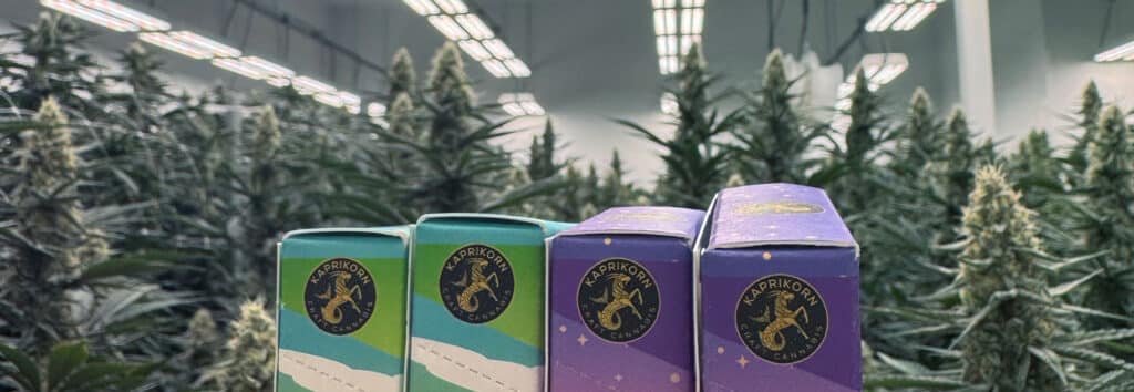
Color is one of the fastest ways packaging communicates emotion.
Before customers even process the strain name, they are already reacting to the color palette emotionally. Different colors naturally create different expectations because people have been conditioned by branding for years across food, beverage, wellness, beauty, and retail.
Darker palettes usually feel more premium or potent. Earth tones tend to feel natural and wellness-focused. Bright warm colors feel energetic and social. Cooler tones often feel calming or relaxing. You see this constantly in cannabis packaging, especially with pre-rolls marketed around different experiences or effects. A sleep-focused line might lean into softer blues or purples. Daytime or social products often use brighter oranges and yellows. High-potency products frequently use darker palettes because they visually communicate intensity before a customer even reads the label.
Over time, customers start learning these systems subconsciously. That familiarity makes shopping easier, which is a huge advantage in a category where consumers already have decision fatigue. The easier your brand is to understand visually, the easier it is for customers to come back to it later.
Simplicity Usually Wins
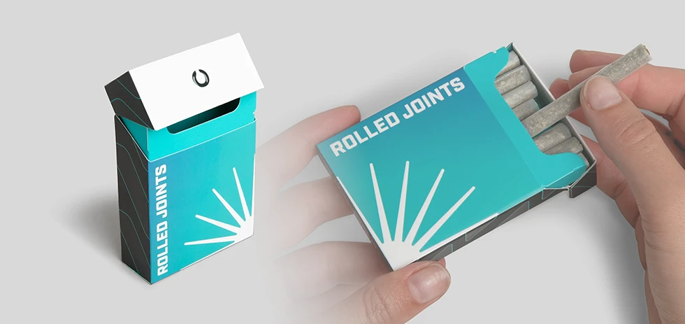
One thing cannabis brands still struggle with is overdesigning packaging. A lot of companies try so hard to stand out that they end up throwing everything onto the package at once. Too many graphics, too many colors, too much text, and too many finishes competing for attention. The problem is that clutter usually creates confusion, not impact.
When customers are overwhelmed visually, the brain starts looking for clarity. Packaging that feels clean and organized is easier to process quickly, which tends to make it feel more trustworthy too.
Some of the strongest cannabis packaging out there is actually pretty restrained. Strong typography. One or two recognizable colors. Clear hierarchy. Consistent structure. It feels confident instead of chaotic. That does not mean every brand needs to look minimalist. It just means the design should feel intentional. Customers should immediately understand the vibe without having to work for it.
Online Menus Changed Everything
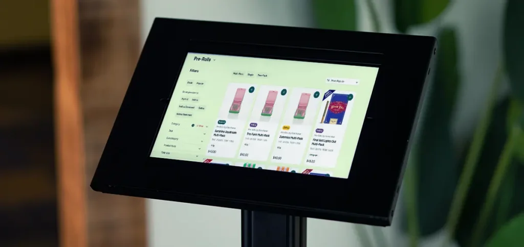
Cannabis packaging doesn’t just live on dispensary shelves anymore, it lives on phone screens. A huge percentage of customers now discover products through delivery apps, online menus, dispensary websites, and social media before they ever see the package in person. That changes packaging strategy a lot.
Tiny details disappear online, intricate graphics become muddy, and small text becomes useless.

What still works digitally are the basics:
- Strong colors
- Clean contrast
- Simple structure
- Recognizable branding
If your package only looks good up close in perfect lighting, it probably isn’t doing its job anymore. The best packaging systems work both in-store and digitally because they communicate clearly at every size. Customers should still recognize the product instantly from a tiny thumbnail on a menu screen.
Packaging Builds Trust Before Loyalty Exists
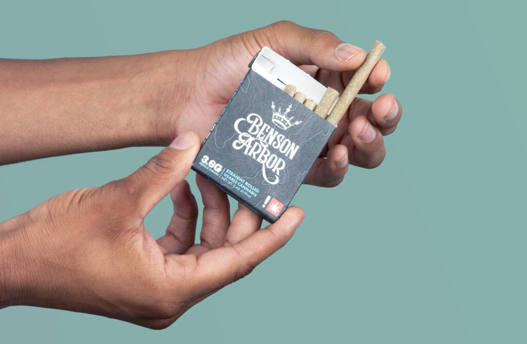
For newer brands especially, packaging often acts as credibility before reputation has time to catch up. Cannabis shoppers still deal with a lot of uncertainty. Products vary wildly between markets, new brands pop up constantly, and customers cannot always verify quality before buying. Because of that, packaging becomes one of the fastest ways to build trust.
Professional packaging signals a brand who’s organized, consistent, and who pays close attention to detail. When labels are easy to read, branding feels cohesive, and the overall presentation feels polished, customers naturally assume the product experience will be more reliable too. The opposite happens when packaging feels messy or inconsistent. Even if the flower is great, weak branding creates hesitation immediately. And in crowded dispensaries, hesitation usually means customers move on to the next option.
The Best Packaging Feels Real
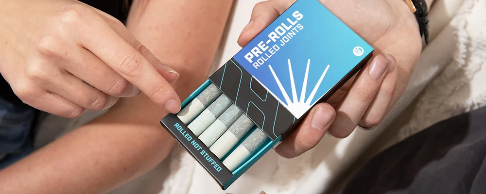
At the end of the day, the best pre-roll packaging isn’t necessarily the loudest or the most expensive, it’s the packaging that feels the most believable. If your brand is built around premium craft flower, the packaging should naturally support that. If the focus is adventure, social experiences, convenience, or wellness, customers should feel that immediately from the design without needing a paragraph explaining it.
People are surprisingly good at spotting when branding feels forced. When everything lines up though, and the visuals, materials, messaging, and overall vibe all feel connected, the product feels more trustworthy and memorable. That is the real psychology behind pre-roll packaging.
It’s not just about making someone notice the product, it’s about making them feel something about it before they ever light it up. Because the reality is, most people aren’t just buying a pre-roll, they’re buying the experience they think comes with it.